Branding · Web Dev
MC Business Center
A business address that looks the part.
MC Business Center needed to feel established before its first tenant arrived. We built a quiet, flexible identity and a site that answers the practical questions first.
- Client
- MC Business Center
- Year
- 2026
- Strands
- Branding · Web Dev
- Studio
- Cat’s Cradle
- Indigo
- Slate
- Stone
- Paper
The brief
A building full of offers, and no first impression.
MC Business Center rents offices, meeting rooms, and mail handling under one roof. The old identity read like a directory listing: useful, forgettable, and difficult to stretch across a building.
We were asked for a brand that could hold the whole offer without shouting — and a web presence that would let a tenant decide before they called.
The work
What the brief became.
Identity
A monogram that holds the building
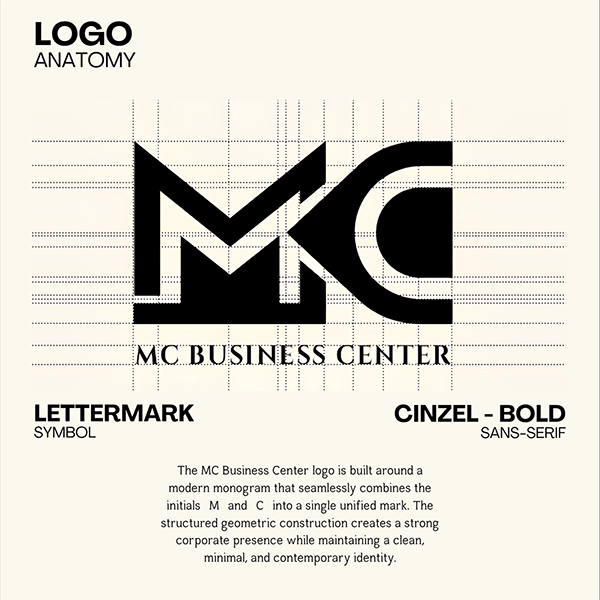
M and C drawn as two connected rooms. It works alone on glass and signage, and locks up with the full name on paper.
Signage
Quiet authority
Deep indigo, warm stone, and a strict grid let the address, the interiors, and the terms do the talking.
Site
A site that answers the first question
Space, terms, and availability surfaced immediately, with a contact path that takes one screen and no hunting.
The result
An address people can find — and remember.
The identity holds from the lobby sign to the lease folder. Tenants meet the same calm, legible system at every step, and the team can extend it without redrawing the brand each time.
The site does the first tour: it shows the rooms, names the terms, and makes the next step obvious.
Services
Deliverables
- Monogram & lockups
- Stationery system
- Signage & wayfinding
- Pitch & print templates
- Marketing site
- CMS setup